My Site
Create Your First Project
Start adding your projects to your portfolio. Click on "Manage Projects" to get started


Advertisement Analysis
Project type
Analysis
Date
September 2023
In this project, we had to choose a color and find advertisements that correlated to that color. We then described what we felt, what the ad was selling, and how it conveyed that feeling. I chose blue and found ads that followed a central blue theme.
In ad 1, for Crest, they utilize varying textures to get different feelings. First off, the bottom portion of the ad has a very reflective, glossy, shiny texture, making it feel clean and fresh. This helps the ad because it reinforces the "healthier gums and stronger teeth" message, because if the "counter" it is on is clean, then surely it will make your teeth clean as well. Another texture in the ad are the dots on the top of the ad. This makes everything feel very orderly and purposeful strengthening their feeling of health, cleanliness, and importance.
In ad 3, for Trident, they utilize varying shapes by overlapping blue triangles that get lighter in blue as they go up. This draws the reader's attention to the center, and because the light gets brighter as it goes in, makes the image feel like it is reaching out towards the viewer, making the gum seem better or more important to the viewer.
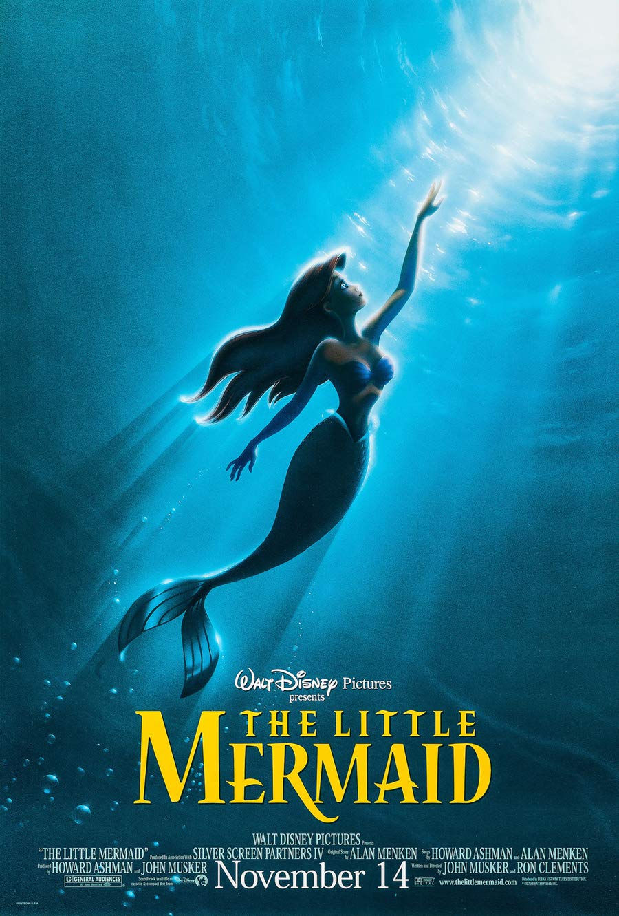
In ad 5, for the Little Mermaid poster, they utilize negative space with Ariel, as the sunlight creates a dark spot over her, giving a feeling of mystery and curiosity, which is a strong theme in the movie.